Black or White
Which background is better? Most text editors and document readers have light backgrounds. But there’s a lot of programmers who use dark backgrounds. And there are a some analytics and dashboard applications with dark backgrounds.

Stephan Few has criticized using dark backgrounds for dashboards in his book Information Dashboard Design, citing an image of Roambi. By the way, Roambi later moved to a white background and then brought back the option of dark backgrounds.
Have you noticed that many business intelligence (BI) software companies have introduced black screens as the standard for mobile devices? Is this because mobile devices work better with black screens? If you look for the research, as I have, it isn’t likely that you’ll find any.
No one seems to question the efficacy of light backgrounds for reading text. Why the difference? Text and graphics both involve objects that are constructed of lines and filled in areas of color. Do they differ in a way that demands a different background color? I don’t think so.
In the above article he discusses arguments by vendors who use dark backgrounds. Most of the arguments he has considered are technical (battery saving, sunlight reflection) and doesn’t discuss which is better if technology wasn’t a constraint. I feel the discussion is biased towards light backgrounds.
The article is based on the idea that because white backgrounds are used in editors and readers for a long time, it is better to stick to it until there is solid evidence that dark backgrounds are better.
Editing and reading software use white backgrounds to mimic paper. Paper is whitish and has been there for centuries. However that was probably because of technological limitations on paper and ink colors. It was not a decision based evidence that white backgrounds are perceptually better.
Edward Tufte has brought it up in one of his discussions.
The usual metaphor for screens (projection and computer) these days seems to be black type on a white background, that is, a paper metaphor. This sometimes results in video glare, with lots of rays coming from the background. Sometimes the old fashioned computer screen seems less tiring, showing lit-up text on a dead backround.
Then he continues to discuss why his website has a light background.
But my metaphor here is paper, like a book. If reproduced on a dark background, my images (which are generally very light in value) would come blaring and glaring out of the dark surround.
Light backgrounds produce video glare. So turn the screen brightness at night and after working many hours at the computer. It is often useful to dull down the electric-blue white of the computer screen with a soft background tone, as done here.
I feel what needs to be considered is how people use your application. If they switch between your application and other applications with light backgrounds (e.g. websites, editors, physical paper), then you should consider a light background. It won’t happen the other way around often since majority of software uses light backgrounds, with the exception of photo editors.
If the software is used in isolation, dark or light wouldn’t make a big difference. Then the factors such as device, power consumption, coolness (aesthetics) and glare can be considered.

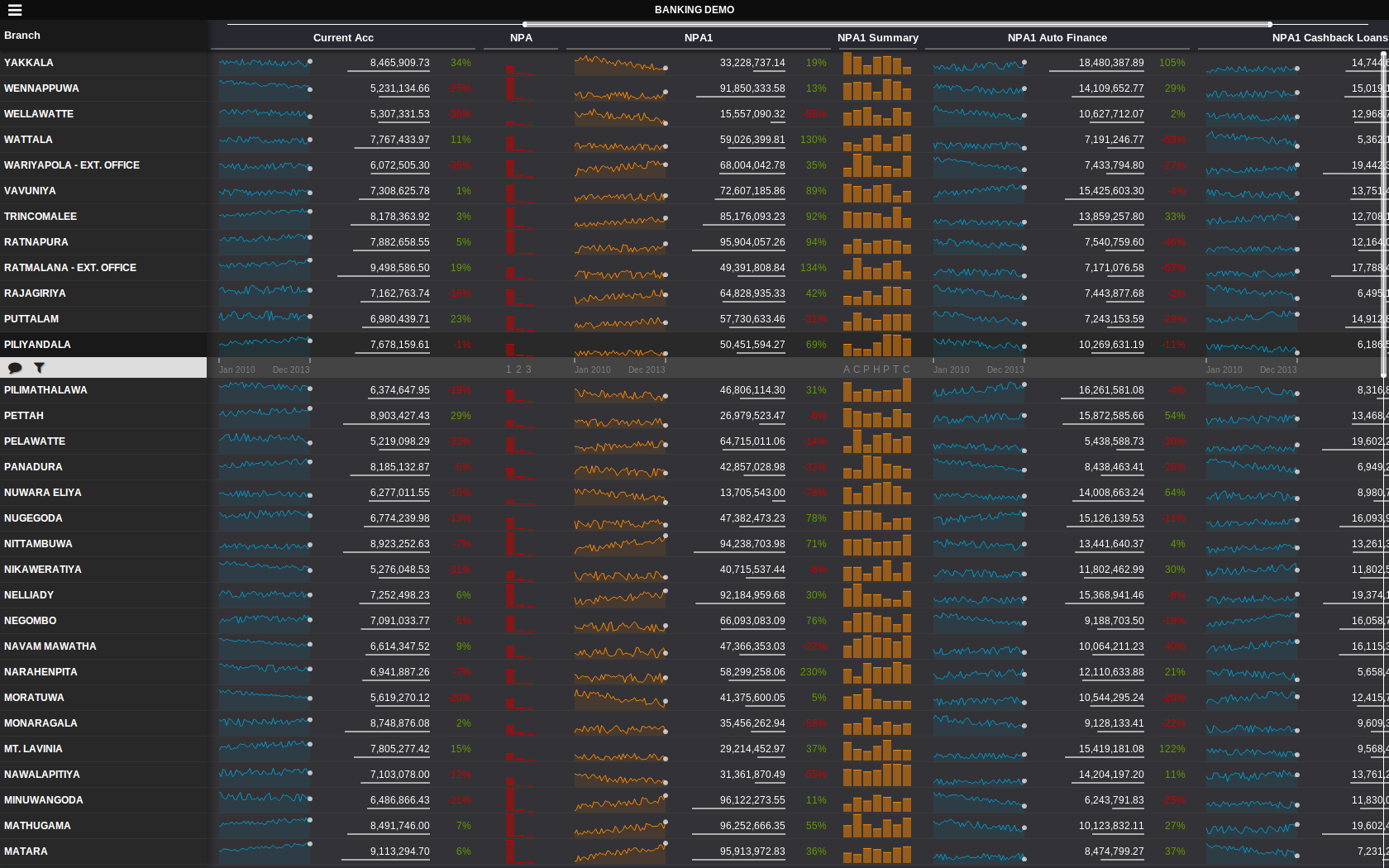
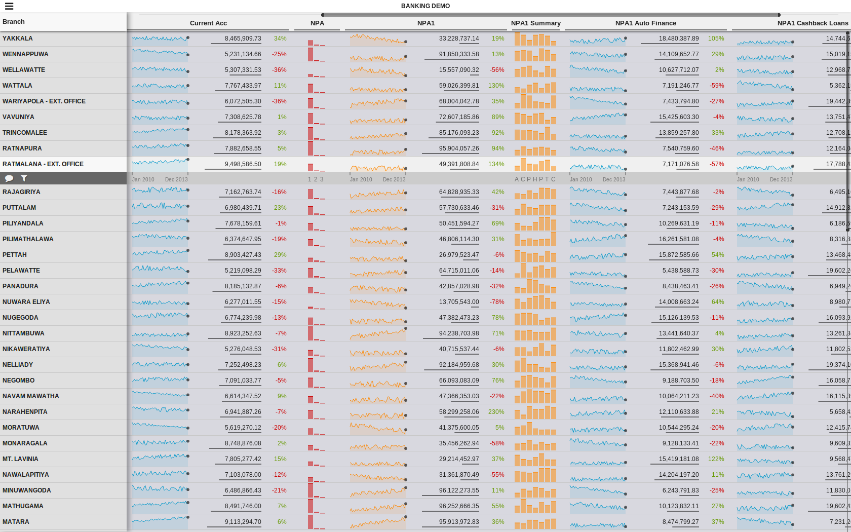
These are just WIP screenshots. We were trying different backgrounds to see which is better. When placed inside this blog, the screenshot with light background looks a lot better because of the surrounding.